
100 Designers. 100 Rooms. Endless Inspiration.
October 28, 2025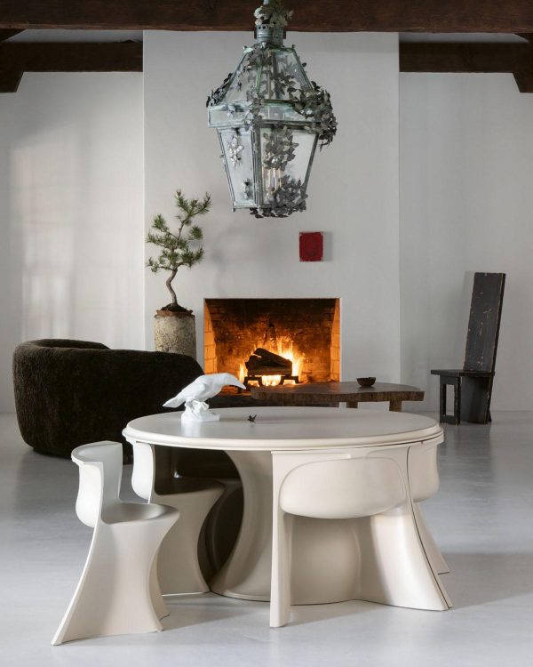
When it was published in 2016, the positive response to my book Interior Design Master Class: 100 Lessons From America’s Finest Designers on the Art of Decoration revealed something surprising and affirming for this design journalist: In our frenzied age of instant visual inspiration and algorithmic design suggestions, people still hunger for more profound wisdom about creating a home.
Since then, in many lively conversations about interior design, I’ve repeatedly been asked one fundamental question: “How do I design a home like the ones I see in your books?” This practical need inspired me to gather another 100 designers, asking them to share specific, actionable advice. I asked them to tackle the questions that challenge everyone who has endeavored to design and decorate a home: How do you successfully combine patterns? What are the key considerations when thinking about curtains? When should you choose high-gloss over matte paint? From these essential questions and many more, Interior Design Master Class: 100 Rooms was born.
What follows are twelve exceptional rooms from the book, each accompanied by an excerpt from the designer’s particular wisdom. You’ll discover that great design is not about copying what others have done, but about understanding the principles that make a room work—principles you can then apply with confidence to your own home.
—Carl Dellatore
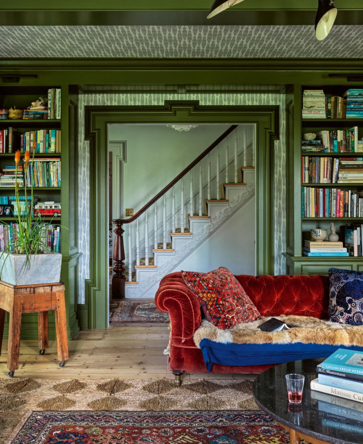
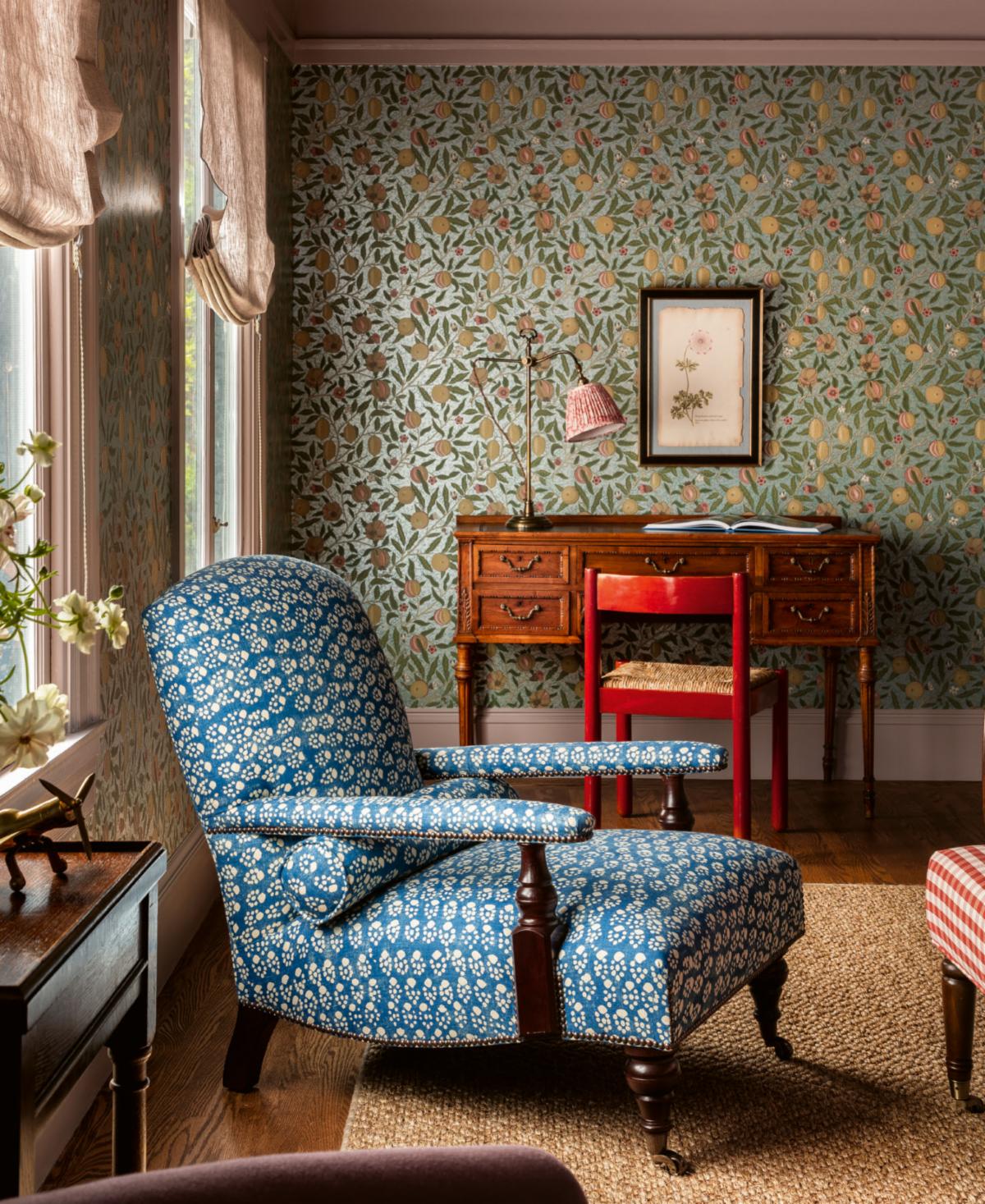
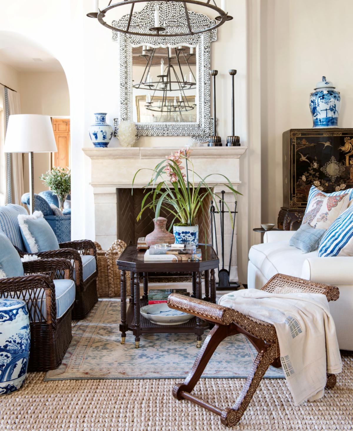
LAYERING
 Designer: Hendricks Churchill
 Designer: Hendricks Churchill
A successfully layered room has a few essential ingredients. It adheres to a hierarchy that shapes the room’s function and mood. This hierarchy includes a variety of furnishings, textures, colors, and natural and artificial light—both ambient and task. A concern for balance of scale and size is paramount when considering the delicate relationship among these layers. Yet a room is most successful when it appears as if none of this was deliberately considered.
First, it is essential to understand how space will be used. What kinds of activities will be taking place in the room? What time of day or night will the room be occupied? How many people will occupy the space? Is the room multifunctional?
Once the program is established, approach the room from the outer layer and move inward. This encompasses making choices that impact the texture and color of the walls, windows, doors, millwork and trim, paint, wallpaper, and curtains. While these layers can be bold, the relationship between them must always remain delicate and balanced. This ultimately creates a livelier backdrop that adds vitality to the room and successfully anchors subsequent layers.
Photo: Chris Mottalini
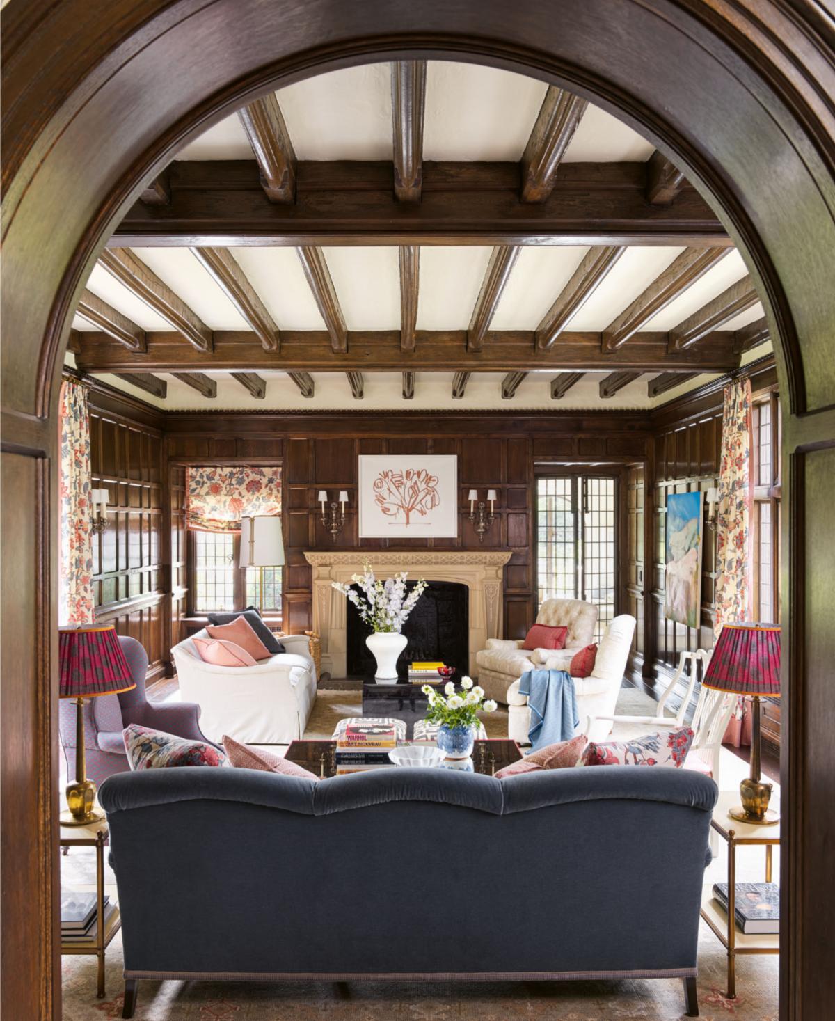
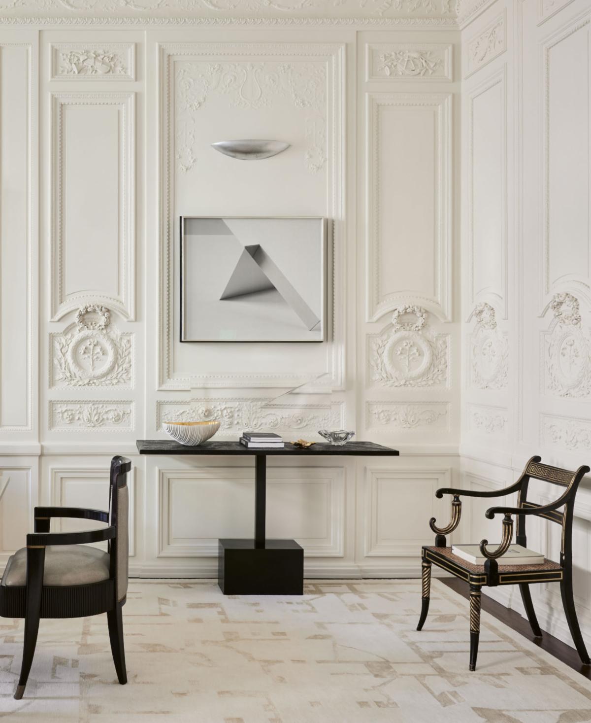
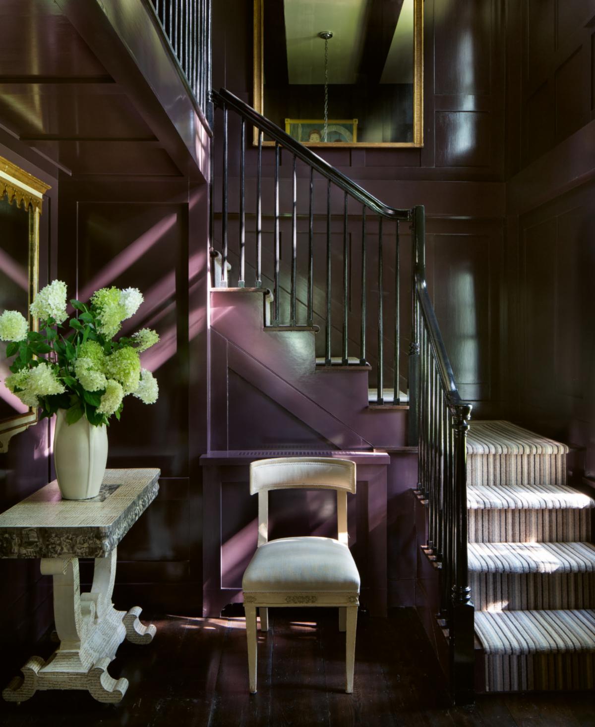
PANELED ROOMS
Designer: Carrier & Co.
 Designer: Carrier & Co.
Paneled rooms evoke tradition, formality, and wealth. When designing within a paneled room, always consider the intended atmosphere of the space relative to that association. Will the paneling serve as a foil to what is otherwise an informal room? Does it have a rich patina that should be preserved?
Paneling itself can be painted. White-painted paneling is a popular choice, as it is more casual and brightens cozy spaces. By contrast, a lacquered paneled room exudes luxury. The gloss enhances the paint’s color, capturing sheen and shadow in its architectural details.
Paneling readily enhances a room’s layered quality. When designing a wood-paneled room, use a variety of textiles—upholstery, rugs, and window treatments — to balance color and pattern. Wooden walls tend to absorb light, allowing for especially bold and vibrant textile choices.
Photo: Annie Schlechter
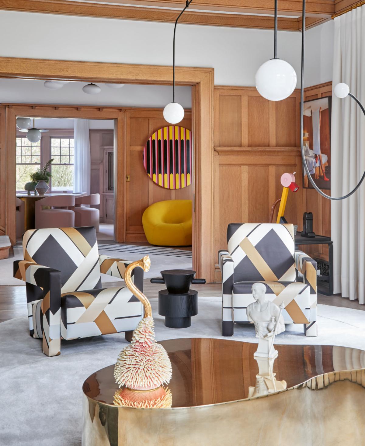
MIXING SILHOUETTES
Designer: Ghislaine Vinas
 Designer: Ghislaine Vinas
Selecting furniture for a room can be challenging, as you must consider more than aesthetics and color. For a room to be successful, all its elements must work together; consider how the shapes and forms will interact. Silhouettes have the power to make or break a space, and there are endless ways to play with composition to create a captivating environment.
One of my favorite ways to promote excitement and energy in a space is to pair extremely rectilinear shapes with rounder, plumper forms. Think of your space as a city’s skyline, and of your eye traveling across the buildings as you take it in. Conversely, for a serene feel, keep all furniture low and use simple, cohesive shapes.
The architecture of the space also plays a crucial role in furniture choices. If the architectural details are busy, simplifying the furniture shapes brings balance. Round forms and soft curves or minimalist rectilinear pieces can set the mood. Conversely, in an unadorned space with little architectural detail, experiment with more dynamic and varied pieces to bring the room to life.
Photo: Garrett Rowland
VINTAGE PATTERNS
Designer: Heidi Caillier
 Designer: Heidi Caillier
The best-designed rooms appear to have evolved rather than having been meticulously planned. They feel familiar, like a scent from your childhood home or a cozy chair you go back to again and again. You may be unable to place them, but they’re comforting and delightful.
To that end, vintage and historic patterns are excellent choices for infusing a room with history and charm. Whether in wallpaper or textiles, they add a rich layer of age and character.
But there is an essential step to making these vintage-infused spaces feel modern: choose what I like to call a “wonky” finish or furnishing that introduces the contemporary yin to the nostalgic yang. A single discordant pattern or color in a room, like an unusual stripe on a club chair or a sophisticated shade of ochre painted on the ceiling, creates visual tension. Such a contrasting element draws the eye and serves as a dynamic focal point, encouraging visitors to explore the harmony in the space.
Photo: Haris Kenjar
MELDING STYLES
Designer: Dan Fink
 Designer: Dan Fink
From where we stand in time, we can see a great landscape of design histories—from the ancient classical, orderly Georgian, and romantic Belle Époque to the glamorous Art Deco, utilitarian midcentury, and eclectic postmodern. Each era, and all those between, played with different forms and details—a push and pull between the ordered and the organic, the exuberant and the restrained.
And further, we’re lucky to have access today to the diverse design cultures established geographically over centuries (not unlike language), even in places that are far from us. In a globalized, globetrotting world, what’s available to our everyday design vernacular has expanded dramatically.
Design work offers the opportunity to know about all of it, and through that knowledge, rooms of all different personalities can be made—rooms that are authentic to where they are and who lives in them.
A great room, like any great conversation, has a cross-section of points of view.
Photo: Nicole Franzen
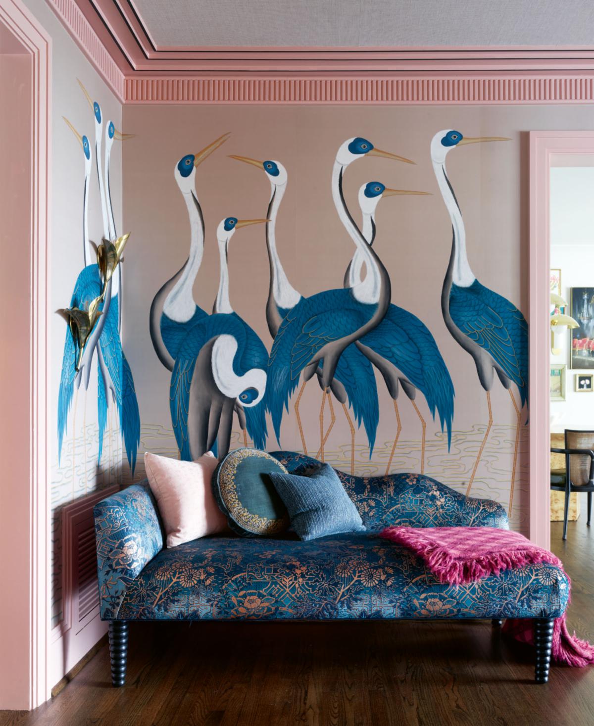
WHIMSEY
Designer: Charlotte Lucas
 Designer: Charlotte Lucas
Introducing whimsical elements into a home’s design adds a playful touch to even the most unassuming spaces. Vibrant colors, mix-and-match patterns, and eclectic pieces infuse rooms with personality and charm. From unconventional furniture shapes to fun artwork and imaginative lighting fixtures, whimsical elements create a lively atmosphere that reflects a homeowner’s unique style.
Sometimes bold design decisions are the key ingredients to a whimsical room—like painting the entryway in a cheery shade of a favorite color or wallpapering a dining room in a riotous floral print atop a navy ground. Alternatively, lighthearted details provide subtle charm, like a group of plates collected from travels that mix effortlessly with inherited china or a lampshade hand-painted with elements that tell a personal story.
But remember: It’s important to be judicious about whimsical elements, because taking things too far can feel cartoonish. Balance vibrant choices with more subtle ones, and above all, remember that comfort is key.
Photo: Chris Edwards
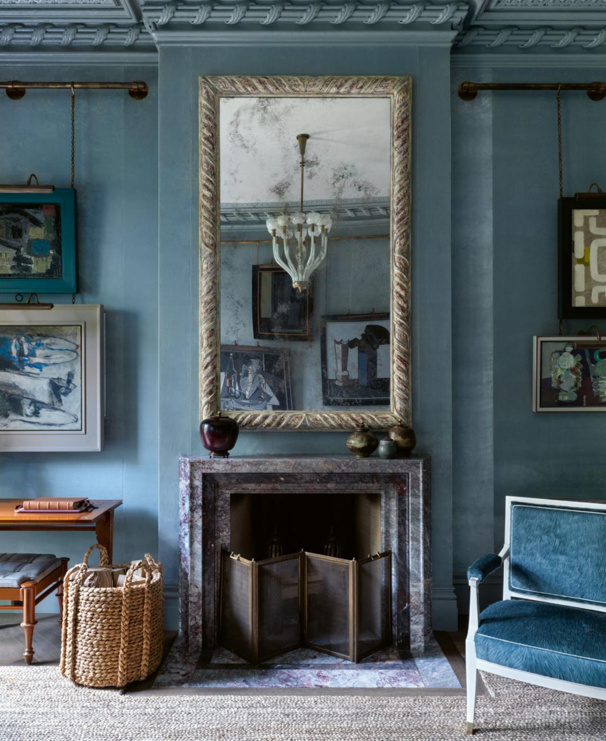
BLUE
Designer: Steven Gambrel
 Designer: Steven Gambrel
Blue has universal appeal. We revere the deep blues of the ocean —reflective and ever-changing —and the pale blues of the sky—warm, inspiring, and enveloping. The complexity of this color in all its tonal versions is its greatest asset. Blue plays well with warmer tones as well, and feels most at home when paired with a crisp white, partly to offset its richness.
Paint and plaster finishes bring out the complexities of blue. Dry layers of integrated plaster in the palest blue tones can feel like ancient stonework, but with a crisper, fresher interpretation. For me, a stair hall or entry hall in a pale gray-blue is more stylish, welcoming, and chic than its beige counterpart. That same scheme could have a high-gloss library around the corner in a deep peacock blue, saturated until you feel immersed in the depths.
Blue is versatile and effortless. We wear blue jeans for casual-chic style and ice-blue dress shirts to convey professionalism. We often write in dark blue ink. Blue is, like a solid citizen, spirited and strong, familiar yet endlessly versatile, always willing to be adapted, adjusted, and combined.
Photo: Ellen McDermott
TABLES
Designer: Mark D. Sikes
 Designer: Mark D. Sikes
Tables are stages where scenes from our lives play out, from the books we’re reading to the plants we’re tending. Each is a small world of its own.
Still, the practical aspects of tables usually come first. Think about how people will use a room and where they’ll need a spot to rest something. Once that concept is clear, begin to incorporate various tables. If a room is large, I like to break it up with a center table to create two seating spaces: a cozier one, perhaps beside the fireplace, and another that’s more expansive against a wall, usually on the opposite side of the room, each with a little table or tables of its own.
Mixing materials, shapes, and scales is vital to prevent them from all reading the same. Good design is often about the mix: combining various silhouettes, materials, and scales to strike the right note.
Photo: Amy Neunsinger
GAME ROOMS
 Designer: Summer Thornton
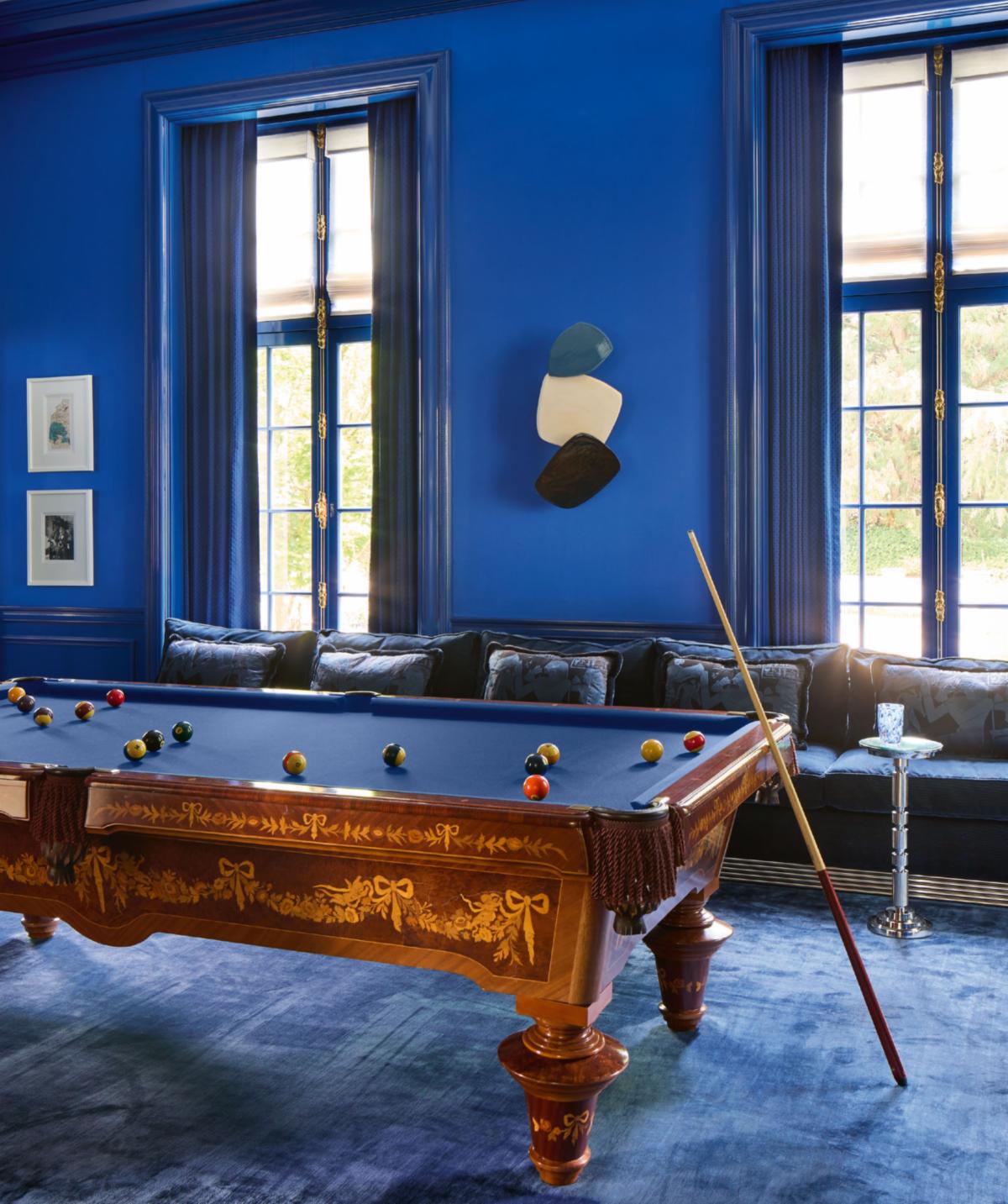 Designer: Summer Thornton
Traditionally, game rooms have been pretty staid, with sad, dark color palettes, too much plaid, and a lack of sophistication. I love designing game rooms because it allows me to turn all that on its head. A game room should not only reflect the rest of the home but take it to the next level. Why not go bolder in the game room? It’s a place for entertaining and should be a wow! Game rooms, after all, are about having fun and letting loose—allow the design scheme to take the lead in setting that tone.
In game rooms, there is typically a lot going on, whether it houses a bar, a pool table, TVs, golf simulators, or all of the above. That busy feel can stand up to an intense tonal palette. Start with fantasy. What is a truly exciting color? Intense indigo? Yves Klein blue? Hermès orange? This is the place to go wild. The game room is the new powder room.
But a note of caution: When decorating game rooms, avoid clichés; no rule book says a game room needs to look like a regression to college days. Let the room speak to where clients are now, and let them put their best and boldest foot forward!
Photo: Annie Schechler
OPEN AIR SPACES
Designer: Marshall Watson
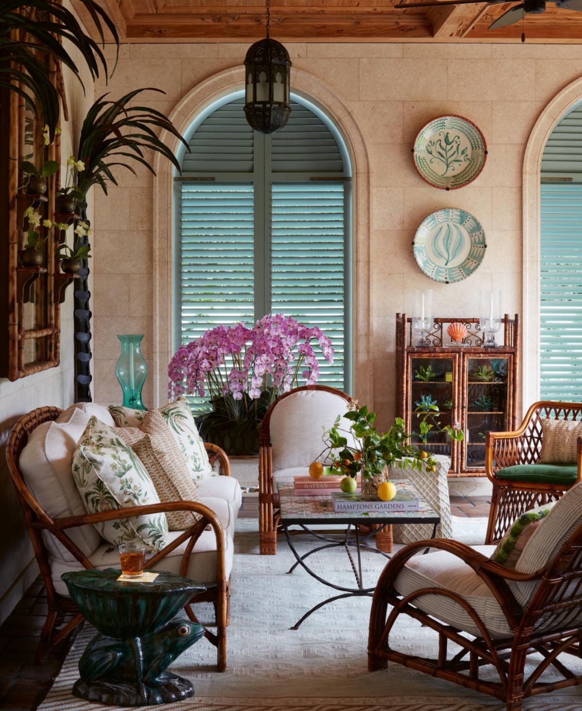 Designer: Marshall Watson
When I was growing up in Kansas City, my family’s outdoor porch, nestled beneath giant oaks and maples and offering a grand view of our gardens, was our favorite spot. The space was protected, so we often gathered there to experience massive Midwestern thunderstorms, which were frightening yet exhilarating.
I try to recreate the joy I experienced on my family’s porch in the homes I design today. A purposeful mixture of indoor and outdoor furnishings helps. Rattan, iron, bamboo, and teak are used for worry-free comfort. Drip-through foam cushions, wrapped in thick Dacron, dispel mold yet offer comfort. With so many spectacular endurance fabrics available, not to mention today’s all-weather carpeting, the sky is the limit for designing fully furnished rooms in the open air. Cabana-style curtains, or romantic sheers in all-weather fibers, can be as supple and sensual as the most luxurious indoor fabrics.
And here’s a trick: Rather than hanging weather-vulnerable artwork, I choose artistic mirrors, which have the added benefit of expanding the space. I also frequently seek out architectural fragments to enhance the area and use houseplants that are perfect for these spaces, creating warmth and interest.
Photo: Luke White
HARDWARE
Designer: Philip Mitchell
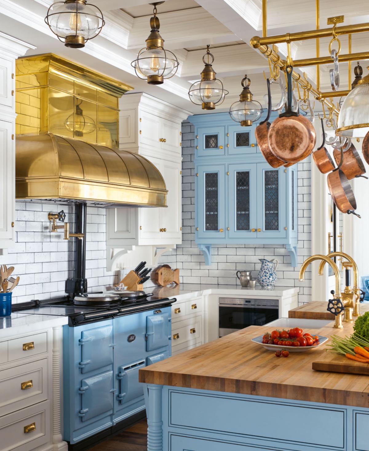 Designer: Philip Mitchell
Choosing hardware for your home is more than selecting embellishments; it is a crucial element in both appearance and functionality. From the most minor details — like hooks — to the functional essentials — like door handles and hinges — every component offers a chance to leave a memorable mark and tell a story.
Selecting the ideal hardware is an art, balancing aesthetics and practicality. Elaborate patterns, unique forms, and striking finishes can capture attention and serve as focal elements in the room. Each selection offers a prime opportunity to mirror your individual style and taste.
Considerations of size and material further refine hardware choices. From ergonomically designed handles that facilitate easy access to durable materials that promise longevity, each aspect contributes to both the visual appeal and practicality of cabinets. Moreover, hardware doesn’t necessarily have to match other fixtures, but it should either align with or complement them.
Photo: Annie Schlecter
MILLWORK
Designer: Glenn Gissler
 Designer: Glenn Gissler
One way to make a room memorable is to install millwork, which refers to anything made of wood applied to surfaces other than a home’s floors. As a rule, millwork is architectural and permanent. It includes moldings, paneling, stair banisters, cabinetry, and windows and doorframes. Kitchen, dressing room, and bath cabinetry are also considered millwork when crafted on-site from wood or transported to a home from a workshop.
Millwork can employ shadows and material contrast to add interest to an interior or, in a more minimalist approach, limit shadows to make interior surfaces appear more planar.
Millwork comes in a wide range of styles, from classical and ornate to modern and minimalist. Traditional styles often feature intricate carvings, moldings, and detailed paneling. (Looking for more on traditional designs? Check out the essential references, Traditional American Rooms: Celebrating Style, Craftsmanship, and Historic Woodwork, and Roberts’ Illustrated Millwork Catalog: A Sourcebook of Turn-of-the-Century Architectural Woodwork.)
My advice? Invest in high-quality materials and skilled craftsmanship, as millwork is a long-term feature that adds value and aesthetic appeal to a home.
Photo: Gross & Daley
|
Carl Dellatore began his career as a textile designer, and has worked extensively in magazines, producing editorial content for House and Garden, Martha Stewart Living, and House Beautiful. He currently works as a content consultant within the interior and garden design communities. He is the author of Interior Design Master Class, Garden Design Master Class, On Style, and More is More is More. |
 |
Opening photo from the section on WHITE ROOMS.
Design by Jane Hallworth. Photo by Jesse Robert Stone.